 EN
EN

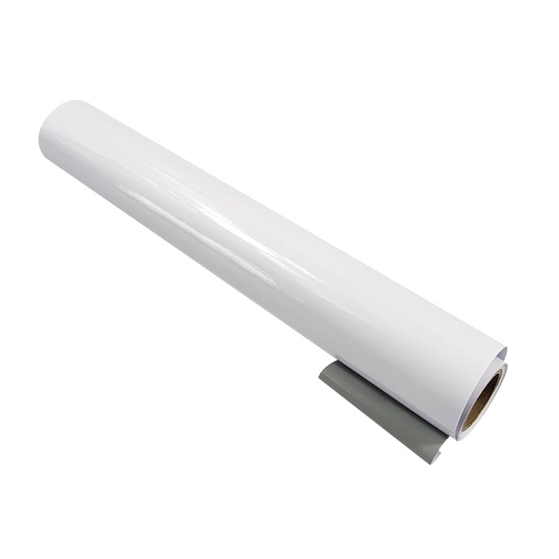
Kraft paper label stickers have become a preferred choice for brands seeking eco-friendly packaging solutions without compromising visual impact. The challenge, however, lies in printing high-contrast designs on kraft paper label stickers that feature textured surfaces. Unlike smooth substrates, textured kraft paper label stickers demand a deeper understanding of ink behavior, pressure dynamics, and design optimization to achieve results that truly stand out. Understanding how to print high-contrast designs on kraft paper label stickers requires knowledge of both technical printing parameters and material characteristics that directly affect color vibrancy and edge sharpness.
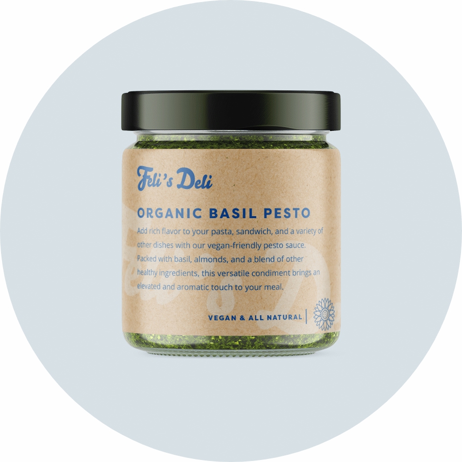
The natural texture of kraft paper label stickers creates micro-valleys and peaks that interact differently with ink than smooth label materials. When printing high-contrast designs on kraft paper label stickers, ink absorption rates vary across these textured zones, potentially causing inconsistent color saturation and reduced contrast visibility. This article explores proven techniques for achieving professional-grade results when working with kraft paper label stickers, ensuring your high-contrast designs maintain clarity, durability, and visual appeal across every label produced.
Understanding Textured Kraft Paper Label Stickers and Ink Interaction
How Texture Affects High-Contrast Design Printing
The surface profile of kraft paper label stickers directly influences how inks adhere and dry. Textured kraft paper label stickers have a rougher surface compared to coated alternatives, which means ink sits partially on the peaks while some liquid penetrates into the valleys. For high-contrast designs on kraft paper label stickers, this uneven ink distribution can soften color transitions and blur fine lines. The key to success is recognizing that kraft paper label stickers absorb ink differently than synthetic materials, requiring adjusted ink formulations and pressure settings to maintain the sharp contrast that high-contrast designs demand.
Material Properties That Impact Contrast and Clarity
Kraft paper label stickers are typically composed of virgin or recycled cellulose fibers that create natural color variation and texture. When printing high-contrast designs on kraft paper label stickers, this inherent color variation can either enhance or diminish visual contrast depending on ink choice and design approach. The alkaline pH of kraft paper label stickers also influences how certain ink pigments perform. Understanding these properties helps you select appropriate inks and printing techniques specifically suited for kraft paper label stickers, ensuring high-contrast designs achieve maximum visual impact while maintaining eco-friendly credentials.
Selecting Optimal Printing Technologies for Kraft Paper Label Stickers
Digital Printing for Sharp, High-Contrast Results
Digital printing offers precise control when producing high-contrast designs on kraft paper label stickers. This technology allows for exact ink deposition, minimizing over-saturation that can blur details on textured surfaces. High-contrast designs on kraft paper label stickers printed via digital methods benefit from consistent color accuracy and the ability to adjust settings per batch. Digital printing platforms can accommodate the absorbent nature of kraft paper label stickers through specialized toner formulations and fuser settings that work harmoniously with the material's texture, delivering crisp blacks and vivid color separation ideal for bold, high-contrast designs.
Flexographic and Offset Printing Considerations
Flexographic printing remains a cost-effective choice for large-volume kraft paper label stickers production, though achieving high-contrast designs requires careful plate design and ink viscosity management. On kraft paper label stickers, flexographic plates must apply consistent pressure across the entire label face to ensure uniform ink transfer despite surface irregularities. Offset printing, conversely, works well for mid-range volumes of kraft paper label stickers, providing excellent color fidelity for high-contrast designs through precise dampening systems. Both methods require testing and calibration specifically for kraft paper label stickers to prevent ink pooling in texture valleys or insufficient coverage on peaks, both of which compromise the contrast quality of high-contrast designs.
Design Optimization Strategies for Kraft Paper Label Stickers
Color Selection and Ink Formulation for Maximum Contrast
When designing high-contrast designs on kraft paper label stickers, color selection becomes paramount. Bold, saturated colors perform better on kraft paper label stickers than pastels, as the natural tan or brown base of kraft paper label stickers can mute lighter shades. High-contrast designs on kraft paper label stickers benefit from colors with high saturation and strong tonal separation, such as deep blacks against white backgrounds or vibrant primary colors against kraft neutrals. Specialized inks formulated for absorbent substrates ensure high-contrast designs on kraft paper label stickers achieve deeper penetration and faster drying, preventing smudging and color bleeding that would diminish contrast clarity.
Typography and Element Sizing for Textured Surfaces
Fine typography becomes challenging on kraft paper label stickers due to ink spread and surface absorption. When creating high-contrast designs on kraft paper label stickers, select sans-serif fonts at larger point sizes to maintain legibility despite texture interference. Line weights in high-contrast designs on kraft paper label stickers should be no thinner than 0.5 points to prevent dropout or reduced visibility. Solid shapes and bold graphic elements work better than detailed illustrations on kraft paper label stickers, as they maintain contrast integrity across the uneven surface. Spacing between design elements should increase slightly when working with kraft paper label stickers to compensate for minor ink spread that occurs naturally when printing on textured materials.
Practical Printing Workflow and Quality Control
Pre-Press Preparation and Substrate Testing
Before producing full runs of kraft paper label stickers with high-contrast designs, conduct substrate testing to understand specific absorption and drying characteristics. Different kraft paper label stickers sources vary in weight, coating, and porosity, all affecting how high-contrast designs print. Create test prints on actual kraft paper label stickers samples using your target design and printing method to verify contrast levels, color accuracy, and ink adhesion. Adjust ink density, pressure, and temperature settings based on test results before committing full production runs of kraft paper label stickers with high-contrast designs. Documentation of successful settings for specific kraft paper label stickers batches ensures consistency across future production runs.
Ink Transfer and Pressure Calibration
Optimal ink transfer to kraft paper label stickers requires precise pressure calibration to accommodate surface texture without causing ink flooding or insufficient coverage. High-contrast designs on kraft paper label stickers demand balanced pressure that ensures ink reaches both peaks and valleys of the textured surface uniformly. Excessive pressure can cause ink bleeding and contrast loss on kraft paper label stickers, while insufficient pressure leaves faint, washed-out high-contrast designs. Monitor first-prints and perform mid-run quality checks when producing kraft paper label stickers to verify that contrast levels remain consistent. Use color measurement tools to objectively assess whether high-contrast designs on kraft paper label stickers meet specifications for color density and contrast ratio throughout production.
FAQ
Why do high-contrast designs sometimes appear less sharp on kraft paper label stickers compared to coated labels?
The textured surface of kraft paper label stickers causes ink to spread slightly as it contacts peaks and valleys, which naturally softens edge definition compared to smooth substrates. Additionally, kraft paper label stickers are more absorbent, allowing ink to penetrate deeper and spread laterally within the paper matrix. To compensate, increase ink saturation slightly, reduce print pressure to prevent over-compression of texture, and choose bold design elements that maintain clarity despite minor edge softening on kraft paper label stickers.
Can I use standard label printing inks for high-contrast designs on kraft paper label stickers?
Standard inks may not perform optimally on kraft paper label stickers because they are often formulated for smoother, less absorbent surfaces. Inks specifically designed for absorbent substrates work better with kraft paper label stickers, offering improved adhesion, faster drying, and better color saturation on the textured surface. Using substrate-specific inks ensures high-contrast designs on kraft paper label stickers achieve superior visual results and greater durability through washing or handling.
How much thicker should line weights be in high-contrast designs on kraft paper label stickers?
Increase line weights by approximately 10 to 15 percent when designing high-contrast artwork for kraft paper label stickers compared to coated labels. Fine lines thinner than 0.5 points risk disappearing or appearing fragmented on kraft paper label stickers due to ink spread and surface texture. Bolder lines maintain visibility and contrast integrity on kraft paper label stickers, ensuring that high-contrast designs remain legible and visually impactful across your entire production run.
Table of Contents
- Understanding Textured Kraft Paper Label Stickers and Ink Interaction
- Selecting Optimal Printing Technologies for Kraft Paper Label Stickers
- Design Optimization Strategies for Kraft Paper Label Stickers
- Practical Printing Workflow and Quality Control
-
FAQ
- Why do high-contrast designs sometimes appear less sharp on kraft paper label stickers compared to coated labels?
- Can I use standard label printing inks for high-contrast designs on kraft paper label stickers?
- How much thicker should line weights be in high-contrast designs on kraft paper label stickers?